14 WTF (Why This Font?)
There are thousands upon thousands of fonts out there. Why stick with Times New Roman or Verdana when you could use a font that looks just like The Matrix? However, will an awesome-looking font really make people like your writing better?
Although computer monitors continue to improve in terms of resolution and clarity, keep in mind that some fonts can look “fuzzy” and thus become hard to read at extremely small font sizes. Under certain viewing conditions (particularly Windows with font smoothing disabled), your fancy typography may be completely unreadable.
There’s a reason why almost every website and blog uses the same small selection of fonts. Usually, people want you to pay attention to what their words mean, not just the way they look. Using too many fonts can make a site look messy and chaotic, which is fine if that’s what you’re going for.
The following sections will help you decide on which fonts will work best for you.
So Many Fonts . . . Which Is the Right One?
Unless you are coding your own web pages, most social media applications will give you little control of typefaces. The what-you-see-is-what-you-get (WSIWYG) editor that you use to create content may allow you to add bold or italics. Sometimes you can change the font size. Rarely will you be able to specify the font.
However, if you are coding your own web pages and have the option of choosing different fonts, start by first considering your rhetorical situation: Who is the audience? What is your purpose for designing? What is the context? Do you want to be humorous? Serious? Are you announcing an event? There are a million things to take into consideration, but the most important thing to consider is readability. Don’t use overly-fancy fonts just because they’re cool. At the same time, don’t use plain fonts when you’re trying to generate some excitement or interest. For example, if you have a Halloween theme going, you can find fonts that appear to be dripping with a liquid (like blood—boo!). Half the fun of fonts is searching for new and interesting ones.
If you want to see some of the many commercial fonts available for purchase, go to Linotype’s web site and check out some of their standard fonts. You can also find free fonts on the Internet, but be careful of viruses or other malicious software and downloads! If you want a safe place to download free fonts, go to dafont.com or fontsquirrel.com.
Note that even if you downloaded a font onto your own computer and included that font in your website design, it was not be automatically usable on the computers of others viewing your site. Until recently, anyone looking at your website would have had to pre-install that specific font file on their own computer in order to see your website as you intended.
For example, if you include the Arial font in your website design, everyone who visits your site must already have the Arial font file preinstalled on their computer in order to see the site the way you designed it. And that font must have the exact same name. The good news in this particular example is that almost everyone already has the Arial font file pre-installed on their computer, so they would see your website the same way you saw it when you designed it.
But if you choose a less common font, like Plantagenet Cherokee, many of your users most likely won’t have the Plantagenet Cherokee font file pre-installed on their own computer. When that happens, a user’s computer automatically replaces the “unknown” font (in this case Plantagenet Cherokee), with some other font that is available, most likely Times New Roman; all of this means that, to at least some of your users, your website ends up looking completely different than what you had intended.
Consequently, you usually want to stick with fonts that are commonly available; see Common Fonts to All Versions of Windows & Mac Equivalents for an excellent list.
Choosing a Font: Serif vs. Sans Serif
Ok, my blogging program lets me pick a font. Now what?
Your most important typographic decision is what will be the main font you use on your pages as this font will set a visual tone for your pages. While there are a variety of decorative fonts that look good as headlines, for this main font, you should pick between a serif or a sans serif body text font.
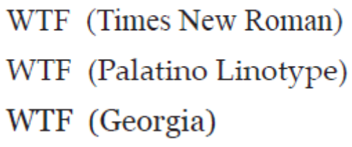
Serif: A serif is the extra little stroke, those little curves, at the ends of letters:

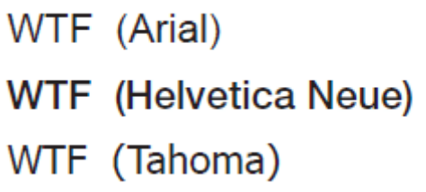
Sans Serif: “Sans” literally means “without,” so a sans serif font does not include any extra stroke at the ends of the letters:

Many people feel that sans serif fonts look “cleaner” and more “modern,” while serif fonts look more traditional, more book-like. The conventional wisdom has been that serif fonts are more readable—particularly in print—while sans serif fonts are more legible. If you have to read large blocks of text, the serifs at the ends of letters makes them easier to identify and easier to read. On the other hand, the simplicity of Sans Serif fonts are thought to make these fonts more legible and easier to read in small sizes or on coarse screens. For these reason, you see lots and lots of sans serif fonts on web pages.
Which should you use? We are not convinced that the serif vs. sans serif argument really matters anymore. Pick a font you like that fits the tone and the message of your site. Pick a font that you think will appeal to the sorts of people that you want to read your stuff. If you have a more traditional site, you may want a more traditional serif font. If you want a more hip, modern look, you may want a sans serif font.
Want More Choices? Use Font Linking
If you find your choice of web-safe fonts to be too limiting or if you want to use a more decorative font for a headline, your choices used to be very limited. One approach was to set your text in Photoshop and save it as an JPEG, but then search engines could not index your content, and screen readers couldn’t read your pages to disabled web users. In addition, every time you wanted to edit your text, you had to make a visit to Photoshop to recreate your image.
Fortunately, in 2009, the major browsers started supporting the @font-face specification in CSS3 (Cascading Style Sheets, see Time to Style Your Document with CSS) that provides significantly more flexibility for website designers in terms of font choices. The @font-face rule provides a mechanism for linking font file that is stored on a server to the content in a webpage. The browser downloads the font file and uses it to set text in that typeface. Joshua Johnson’s The Essential Guide to @font-face (2010) provides an excellent summary of current @font-face solutions for those who are coding their own websites. In his review, Joshua mentions sites such as TypeKit and FontSquirrel, which provide both free and paid font solutions.
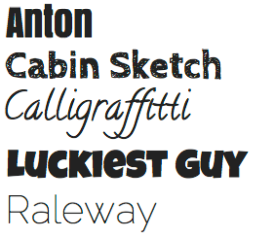
Joshua also mentions the Google web font service which has expanded considerably since the article was published. TypeKit partnered with Google to develop a simple open process for using CSS font-linking, and in 2010 Google began their Google Web Fonts font sharing service. (You can read more about this service at the Google Web Font Blog.) As of May of 2011, the Google webfonts site offers 148 open source typefaces for use on your webpages. These fonts include many decorative typefaces that are well suited for use in headlines.
The Google/Typekit solution is straightforward and easy to use. The fonts are stored on Google servers. You link to a Google style sheet for the typeface you want to use (Google even supplies the linking code), and then you add the font to your CSS rules (Google includes sample rules as well). As an extra bonus, all the fonts are licensed to be used for free on the web.
Blogger now offers the Google webfonts as choices in its WSIWYG text editor; we suspect many other platforms will follow.

text editor; we suspect many other platforms will follow.
